Opening:
February 21, 2021
Closing
July 1, 2021
Participating artists: Hannan Abu-Hussein, Sagie Azoulay, Meydad Eliyahu, Shahar Yahalom, Karam Natour, Maria Saleh Mahameed
Curator: Irena Gordon
3D-toor at the exhibition and workshop (floor 1)
This is a unique and comprehensive project initiated by the Jerusalem Print Workshop, which invited six artists to create a new body of work in print, referring to the history of the Persian-Islamic arts of painting and miniature, whose traces have designed the local culture and aesthetics for hundreds of years. The title of the project is the same as that of the book My Name Is Red by the Turkish Nobel Prize laurate Orhan Pamuk. The book deals with the encounter between East and West, between Middle Eastern Islamic traditions of painting and Far Eastern arts, as well as Western-Christian, namely Renaissance, arts. It recounts a story of murder and love, taking place in 16th-century Istanbul. It revolves around an illustrated book commissioned by the Sultan to praise and glorify his kingdom, set against the backdrop of the conservative Muslims’ struggle against Western influences.
Painting in the Islamic world developed mainly as miniature, a medium that flourished circa the 13th century, during the Abbasid Caliphate of the Arab-Muslim Empire. The miniatures initially appeared inside a small box next to the text, though as the years passed, they expanded, broke out of the box, and were charged with meanings of their own. Under Ilkhanate rule in the 14th century, the field of painting developed even further, mostly in handbooks of pattern combinations, which were widely used in manuscripts. During the rule of the Jalayirid dynasty, which was situated mainly in Iraq and regarded itself as the successor of Genghis Khan, painting was influenced by the Bagdad school and by artists from Tabriz and Shiraz. Cultural prosperity was noted during the empire established by the Mongolian-Turkish conqueror Timur, giving rise to the painting school of Herat, one of the two main capitals, which attracted artists from across the empire. This school culminated in the 15th century, and was distinguished by Sufi and spiritual interpretation. The artists, who in practice formed a canon, worked in collaboration and were extremely careful to maintain uniformity of style, while rejecting and denying any individuality of handwriting by a specific artist – an approach counter to European tendencies at the time, which gave more and more prominence to the uniqueness of the individual artist’s style.
Pamuk gives a voice to the artistic act, its imagery, color and relationship with the world – a consciousness that differentiates between being and not being. The red color says: “…” (cit). The six artist of the project examine, with the book as an inspiration and using the various printmaking techniques, the social-political structuring of representation, as well as its duplication and interruption; the place of cultural traditions; writing and language as a network of symbols and representatives of significance; and the spaces of color and outline of the form as physical and mental entities.
The artists worked in continual dialogue with the master-printers of the Workshop – Ran Segal, Yoav Raban and Eitan Hurvitz.
Hannan Abu Hussein
The book My Name Is Red by Orhan Pamuk takes place in the 16th century, but it is still relevant today, as it deals with art as a space of discovery and exposure. In the story, art is a key to the relationship between the solving of a miniaturist’s murder and love: the miniaturists are asked to secretly illustrate a book for the caliphate, whose purpose, among other things, is to pose as a counter-reaction to the West. The murder takes place against the tension between tradition and progression, between Islam and Christianity, between the patriarchal and matriarchal worlds. The question of who committed the murder also concerns questions of art and its place in the world. Meanwhile, relations of power and violence in society, especially between men and women, unfold.
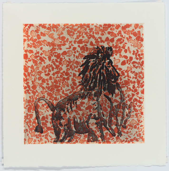
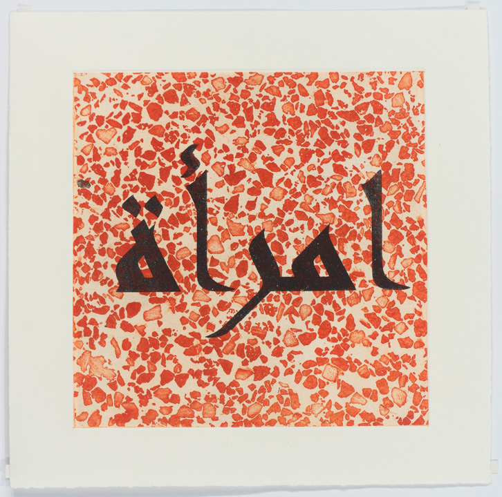
In my artistic practice in general, and in the series of etchings I created at the Workshop in particular, I attempt to invoke a discussion about the women murdered in the name of family honor and the social-cultural responsibility for their murders. The series imitates local tiles with motifs from Pamuk’s novel: a lion eating a pig, thus signifying the attack on Islam; the eyes and eyebrows of the Jewish Esther peeking through a veil, embodying the discussion on portraits, namely of women – an aspiration of the protagonist, Shekure; a needle indicating craft and female and male works, the art of miniature and painting, and the concepts of vision and blindness. On the tiles appear the pejoratives directed towards women as they appear in the book, expressing the constant threat on the woman and her place in the world. Moreover, in this respect the book reflects also the fragile position of the artist, as Pamuk is a writer who is repeatedly under attack in the Muslim world due to his criticism of the environment and culture where he comes from and about which he writes.
Sagie Azoulay
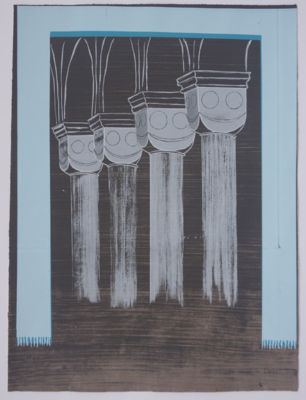
The novel My Name Is Red opens with the voice of the spirit of the royal miniaturist, which left his body after his murder and remains hanging between life and death, indicating the relationship between the body and the soul, between the “vessel” and the anima. I wish to discuss the animinstic dimension hidden in objects, plants, architectonic structures. I seek the living spirit that exists in the inanimate, witnessing the surrounding movements, perceiving and assimilating them. Of the prints I created at the Workshop, some are based on imagery I created over the past three years, and others on new images: smoking cacti, floating pillars, smiling vessels and a thicket of leaves that may have endured a hidden worm. The images have human traits, they are objects with spirits, heavy structures turned light, images seeking to escape the visual, the flat, and become three-dimensional. My works originate in archeological and contemporary, Mediterranean and autobiographical worlds. This is all combined with the self-humor of a work observing itself.
Work at the Jerusalem Print Workshop, from this vantage point, was challenging and exciting. The screenprint technique compelled me to re-think about the image and the composition. It enabled me to enter each and every layer of the painting: the slightest places of light and shadow, the ways in which the image is created and its relationship with the background. While working, I felt as if I was rewinding the subconscious of the two-dimensional visual action, just like when I paint – I work in layers, and when I look at the final work I see both the print and its undoing. Printmaking sharpens the visual creation as one that reveals and hides its sources at once – pointing to them and covering up their traces within the language of the artist, which merges with the medium.
Meydad Eliyahu
I have always explored in my practice relationships between East and West and between the ancient and the contemporary. In the past few years I have been studying the color red in relation to cultural, collective and personal images. The series of prints I created at the Workshop in the framework of the project My Name Is Red continues my engagement with suppressed memory, identity and culture, while employing the color red. In the new prints I process traditional images by interfering, erasing and re-creating inside the layered process of screenprinting.
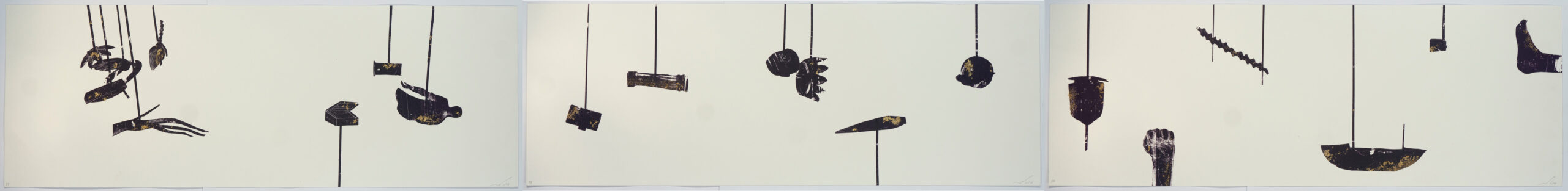
Five years ago, I started consistently exploring the artistic manifestations of the Cochin / Malabar Jewish community in India, where my father comes from. I created an index of objects and articles embedded with an encrypted secret, symbols and signs I didn’t know how to decipher and it seems that no one else would – crowns, peacocks and parrots, unicorns, lotus, and jasmines – all these and others were like remains of an abundance that was cut off abruptly. To create the layers of the print “Hybrid Creature,” I tore apart and re-pasted the materials, melted and welded them to make them hybrid, physical and fleshy, swaying inside an empty space, supported in order to live again, exist again as breathing cultural creations. And nevertheless, they move in discomfort inside the local space where they are immediately noticed as alien.
The “Pendulum” represents movement between motifs, movement of the incomplete parts, which moves things along. Its constant movement, which is of an unstable, undermining nature, is for me a reliable ground, an infrastructure of truth. The gold appears as an allusion to the golden leaves in Islamic miniatures, and meanwhile creates, in its crispiness, a sense of floating, fragility and incompleteness.
Shahar Yahalom
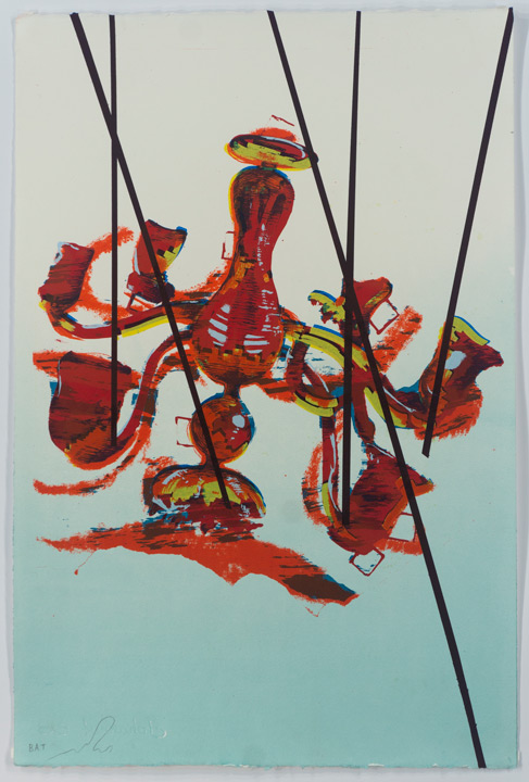
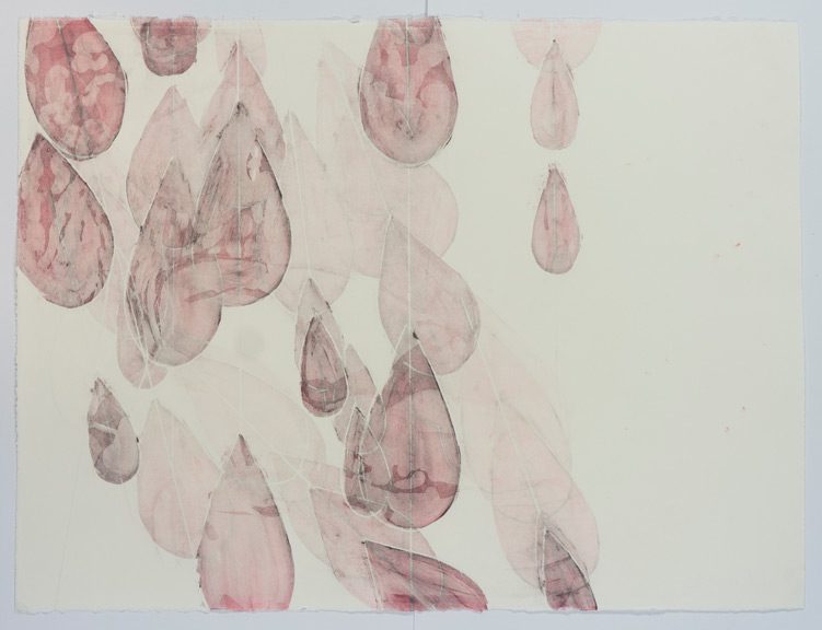
In the framework of the project My Name Is Red I created at the Workshop the series of etchings entitled “Blunt Livers,” which consists of sixteen works. The series is based on two sheet-sized etching plates printed one on top of the other. In each printing, another area of the etching was furnished with paint; each print thus exposes another area of the printed plate. Each area which had been exposed to paint continued to be embedded as a ghost in the next printings, so that in each printing a faded memory of the printings that preceded it remained. This ensemble of accumulations creates a delicate arabesque of images of faces, limbs, forms and spaces that blend together in bubble-like movement and reddish transparency. The history of the image, its memory, is both present and absent.
The image that guided me above all was an image of a group of breathing-smoking people mixed together, breathing on each other. I sought to create a drawing whose limbs are mixed together. The prints capture the moment when the form breaks, just before taking on a new one. I strived for a sense of dissolving, created by extremely delicate etches; these created a mixture of stains. In the printing process I attempted to extricate every time a different image from the pile of limbs, by marking a certain area of the graphite and exposing it to color. The initial portrait of the people became a landscape of cigarettes and eyes: one body composed of many, searching for self-definition, progressing and retreating; a violent and embracing act hanging between assimilation and separation.
Karam Natour
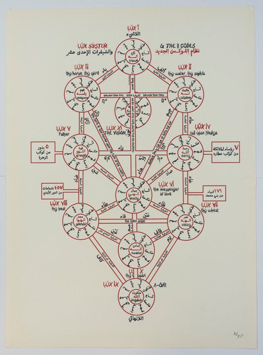
The series creates a visual dance of geometric shapes with language and writing, and assigns the written word attributes of an alchemical code. My own body appears in most of my previous works; but here, for the first time it doesn’t. In its stead are systems of language and mystics originating in the body. The relationship of the word and form with the body varies from work to work, but it always generates a visual system that expands the boundaries of both the language and the form. I link the Hebrew (my mother tongue) to the English, which is seemingly a universal language, and hence attempt to bridge the personal and the global, the internal and the exterior, with the black color as a basis for drawing and writing, and the red as the primordial human inclination.
In the print “Pain” I create a kind of fictional calendar alluding to the worlds of astrology, alchemy and magic. The Hebrew text appearing in the upper part of the print reads, “This is a new system,” and then, “This is the new Renaissance.” I hence proclaim the print as a prophecy for a new era of cultural thoughtfulness. In the print “Hymn” I refer to the Greek god Dionysus, the god of wine and worship. The composition is like a visual melody dedicated to him, with phrases and words such as “Welcome come in,” “Mr. Wilderness,” and “Dionysus” (Hebrew) floating as part of the network of imagery. In “Love” I take apart the word “Love” in Hebrew, scattering its letters in a geometric structure resembling a heart shape or its destruction. The print “Fingers” functions as a kind of spell: its headline reads in Hebrew, “Let’s move together like water, let’s move together like wind,” with a mysterious system underneath whose aim is to help the viewer loosen up and engage with the work. “Witch” is a kind of self-portrait where I appear as a witch that is neither male nor female. The key to “Dick” is a phallic object with “in&out” written on its aperture. In the print “22” appears the personal tree of life that I created, and “LiveLong,” the last print in the series, indicates a euphoric celebration of life.
Maria Saleh Mahameed
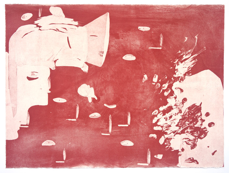
As a daughter to a Ukrainian mother and Palestinian-Israeli father living in the village Ein Mahil, I bring together in my etchings Eastern and Western traditions. In my work in drawing and print, reality meets my autobiographical events in a mythical, Odyssey-like point, beyond the here and now. My present body of works in etching deals with decorative motifs extracted from the local landscape and traditions, alongside images of animals as a metaphor for human struggle, which is rooted deep within the local traditional iconography.
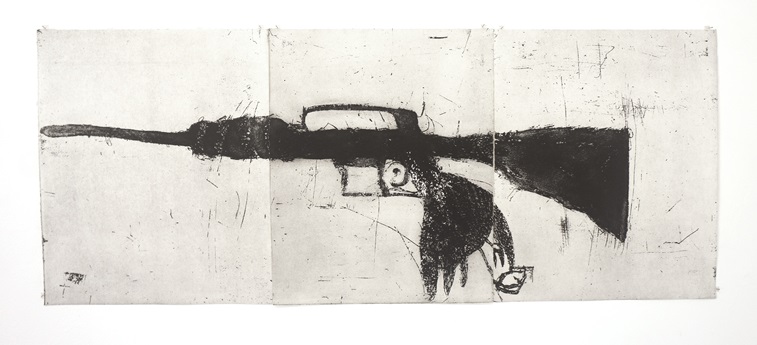
In many ways, my starting point for the project is the image of the tree in the novel. Pamuk gives the illustrated tree a voice: “…” (ref.). The tree is a concept. It holds many stories, expresses entire lives. From this tree of life, which conceals tragedies, rise the compositions and images of the etchings: a pregnant woman, a gun and a pigeon, a gun and still life on a table, a dying horse, a rifle, a separation barrier.
Jerusalem Print Workshop | 38 Shivtei Isreal St. (HaNeviim corner), Jerusalem | Opening Hours: Sun – Thu: 8:00 – 15:00, Fri – By appointment